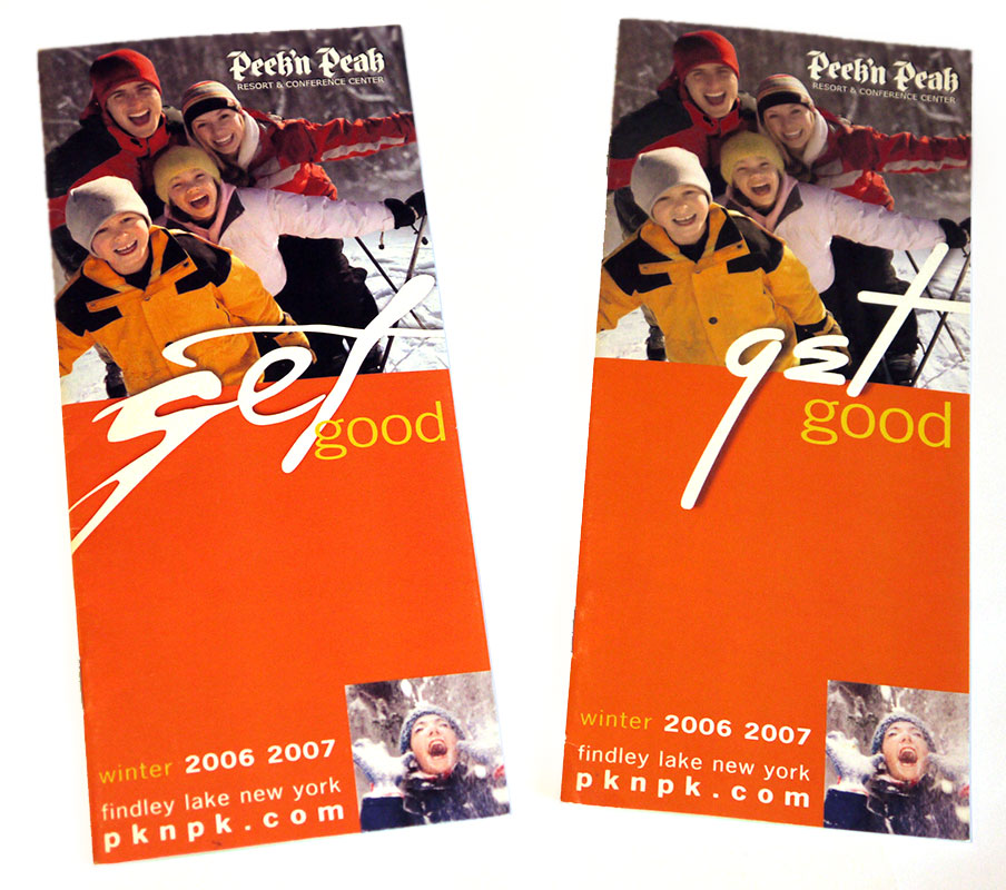
Sex Good? That’s what most people saw when they looked at the 1st Version that was printed (pictured on the left.) The catch phrase was “Get Good” but the font chosen did look like SEX. Sex does sell, as these brochures flew off the racks. All that were printed were gobbled up. They chose to run a second version where the font was changed to a more legible GET. But, in hind sight, this oversight, got more brochures in peoples hands that ever before. Brilliant or blunder?
I worked on this brochure in the capacity of finding an image of happy skiers. I purchased a stock image of a happy family pictured in blue skies, probably in Whistler. But for our region in gloomy Western New York, I chose to replace the background with grey trees which are more identifiable to the region with this was distributed.